VISUALIZATION IN R
VISUALIZATION IN R
Hello! Today, I’ll be talking about some of the visualizations I learned to create in R, along with my current math progress and future requirements. Let’s get into it, shall we?
Analytics
This week, I learned how to visualize data in The Analytics Edge on edX. There are a ton of different ways one can visualize data: heat maps, histograms, graphs, charts, word clouds, etc.
Visualization (let’s see how many times I use that word today) is important because it can give you a better understanding of the data that’s been analyzed. It’s one thing to look at the numbers and see the statistical significance of a prediction, but it’s quite another to see that information on a graph or map. It helps you understand the meaning much better.
And it’s easier on the eyes.
R has thousands of free “packages” that can be downloaded to assist with different functions. Its base functionality is pretty extensive, but for this course alone I download several new packages every week.
Up until now, all of the packages have been used to assist with analytic techniques that R cannot do on its own. For example, packages are required for Classification and Regression Trees (CART), text analytics, ROC curves, etc. There are even medical packages that can be used to create better clustering of MRI images, which would have made last week’s images more accurate.
They work seamlessly in R to improve its operations.
This week, we used different packages to improve upon plots. The visualizations that I’ve posted in previous journal entries have been rather lackluster. Although some of those can’t be changed too much and wouldn’t integrate into the new visualizations, most of the data can be plotted differently.
We overlaid past predictions about the 2012 U.S. presidential election on a map of the United States. This allows you to see which states were predicted to vote which way, rather than looking at the statistical likelihood of each state. This map in particular was incorrect, because Florida was expected to vote one way, and it voted another.
Heat Map
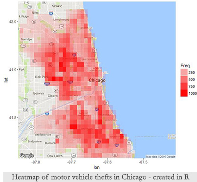
We were able to plot a heat map on an actual map of Chicago showing the locations where the most motor vehicle thefts occur (see map above ). It looks great and it’s perfect for a presentation or predictive policing.
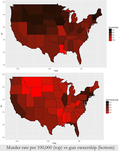
I know this is a controversial topic nowadays, but I found our next map to be pretty interesting. Using FBI data from 2010, I created two heat maps. One included the murder rate (murders per 100,000 people) for each state. The other shows the gun ownership per state. They seem to be on opposite spectrums: states with higher gun ownership have a lower murder rate.
Note: As I mentioned, this data is from 2010. I’d be interested in finding more current data if it’s available to see if there are changes in these figures.
Also, Washington D.C. was removed from the murder rate map because it is an “outlier.” The murder rate there was far higher than anywhere else in the United States, and it skewed the heat map quite a lot. Basically, all of the other states were colored dark maroon.
Line Graph
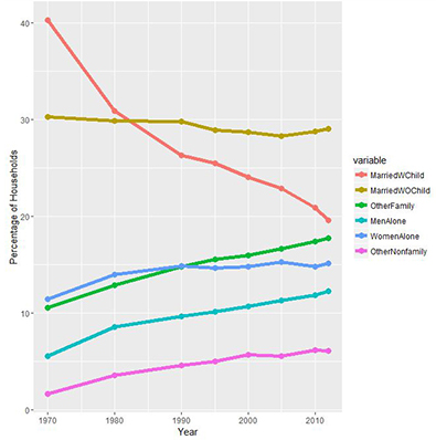
For one of my lectures, we created a line graph of household composition from 1970 to 2012. The graph doesn’t look like much, but I did find some of the results to be pretty interesting. The most obvious variable, which isn’t all that surprising, is that married with child has gone down a lot since 1970, while living alone has increased. Married without children has remained fairly steady.
Word Clouds
Last was one of my favorite lectures, albeit a bit less useful than the other visualizations, involving the construction of word clouds.
Word clouds are a group of words that are used most frequently in a dataset. The most frequent words are the largest in the word cloud, while the least frequent will be the smallest.
For the assignment, we created a word cloud from a dataset containing Twitter tweets about a specific product. The most commonly used words in the tweets made up the word cloud. It didn’t look all that impressive at first, but I began playing with it more after the assignment and ended up really liking the way it looked.
I then decided to make one of my own in R. There are websites that create word clouds for you, but doing it in R allows you to customize it however you want, from the color palette, word frequency, removing specific words, size, etc. The combinations are endless.
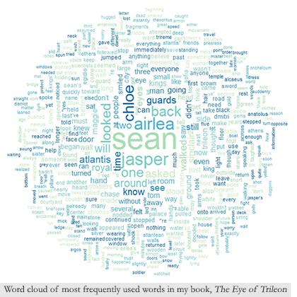
I decided I wanted to turn my novel, The Eye of Trileon, into a word cloud. That was the coolest thing I could think of to use and I was really excited about the prospect of doing so.
The problem involved having no clue as to how to convert structured text into a dataset readable in R. As I mentioned last week, all of the data we use is clean and organized in a list or table. Obviously, I wasn’t about to turn a 418-page book into an Excel spreadsheet.
It turns out, it’s not all that difficult to read in to R if you’re using it for this purpose. I could probably even run text analytics on my book, as a lot of the commands and functions I used to create the word cloud are the same.
I removed all stop words (i.e.: “the”, “is”, “and”) and “said” because that’s one of my most frequently used words, and it looked dumb on the word cloud. I also only included words that were used at least 30 times in the book. Otherwise, it looks like a giant box of words going off the screen.
Then I made my word cloud, and I think it looks awesome! Again, it’s not all that useful in the presentation of statistical data, but it looks neat nonetheless.
Math
I think I spent more than enough time writing about analytics today. On to math!
I finished algebra II on Khan Academy this week. I didn’t think I’d finish, because I rarely meet my expectations. And I almost didn’t. I spent at least 4 hours a day for two days on math lessons, in addition to my normal analytics lessons. After those two days, I was extremely burnt out on math.
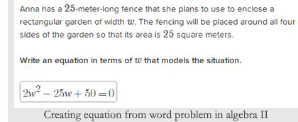
I began algebra II around July 13th, so it looks like I’m still following the one month per class routine. As I mentioned last week, that’s far faster than anything I have done or could do in school.
I only hope that I’m able to retain all of this information.
My next class is trigonometry. I looked through the lessons, and it turns out that I completed the majority of the lectures already because they’re interconnected with geometry and algebra II.
So that’s good news. I doubt it will take longer than a few days to complete all of the trig lessons.
Then, precalculus. . .
I’m not so much dreading calculus as I am all the classes I still have remaining.
I’ve been doing a lot of research into the requirements of being a data scientist. I always knew I would need linear algebra and statistics, but I wasn’t certain that I would need any calculus classes.
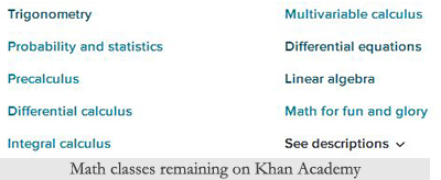
It turns out that I do, although it greatly depends on what I plan to do in the field of data science, as it’s quite broad. Multivariable calculus is extremely important for someone specializing in machine learning, which is ultimately what I plan on doing.
That means I have 8 more math classes to go, including trig. I’m not surprised or disappointed, but I was hoping to move along more quickly. At this rate, I won’t finish math for another 8 months. I’m also assuming as the math gets more challenging, I’ll be spending more time on each class.
So kids, don’t let anyone tell you that Barry tried to take the easy route or half-ass anything! I’m a full ass, through and through.
Conclusion
Though it may seem as if our dreams are unattainable, don’t falter. It’s easy to be disillusioned or give up when it becomes difficult.
I waited almost two years after deciding to be a data scientist before I began doing anything about it. Why? Because I was scared. Scared about how much work it involved. How much I had to learn, and re-learn. About how little experience I had and not knowing if I could ever possibly amount to my own expectations though nothing but online education. There were also extenuating circumstances happening in my life during that time, but fear was the biggest part.
It would be so much easier to fall back on what I know and forget about all of this.
But then I would never feel fulfilled. I would never accomplish my dreams. I would never make a difference in the world, which I want to do. When I say that, I don’t mean affecting the world like the president or a supreme court justice. I want to be a part of a team that’s doing something that helps others. That’s what it boils down to. I want to have the knowledge and experience to be a part of something great.
That’s my dream. A dream can be anything you want it to be. If you want to be an actor, hotel manager, grocery store clerk, scientist, husband, wife, a parent, musician, to be able to travel the world, or even to the next city, you should work toward that goal. As long as you don’t hurt anyone else, there are no bad aspirations (I wrote dreams here originally, but there are nightmares!).
That’s one of the reasons I’m writing this journal. Not so you can become a data scientist or follow in my footsteps, unless that’s what you want. Not to brag about how quickly I’m completing my math classes. There’s nothing to brag about since I already took all these class many years ago!
It’s to inspire others to reach for their dreams, even if it seems difficult or impossible. I wonder everyday about whether or not I will ever achieve my goals, but I won’t stop until I know for certain, and neither should you.
I’m sorry for the lengthy conclusion. I hope you’re doing well and I’ll see you next week.

Author and hobby digital artist. Barry aspires to become a data scientist and better himself as a person.