SEVEN YEARS
PROJECT DETAILS
TITLE: SEVEN YEARS
DATE: 31 OCTOBER, 2016
CATEGORY: DIGITAL ART
ONLINE: ANOVIUS.DEVIANTART.COM
CREDITS:
PEOPLE
Witch:
Fluffybunny29stock: White Witch 3
Demon:
Null-Entity: Reaching Foreshorten Down
Demon skin:
ElaineSeleneStock: Cracked Dirt Texture 2
Smoke around demon:
MD-Arts: Smoke IV
Warlock:
Me!
MAGICAL OBJECTS
Bird body:
Momotte2stocks: Bird 327 - charming crow
Cat head:
moxylyn: Black Cat
Model: Bear Bear
Magic / portal:
dbszabo1: misc png
Staff:
cgartiste: Staff of Shadows
Arcane circle:
Obsidian Dawn: Arcane Circles II Brushes
LANDSCAPE
Ground:
salawat-shiadesigns: desert cracked
Forest:
SabrinaFranek: Mountain Lake Panorama Stock
House:
Irie-Stock: Old house WV2
Skeleton:
markopolio-stock: Skeleton – Hanged 1
Fog:
moonchild-ljilja: Fog layer
SKY
Clouds:
shelldevil: Unrestricted Stock – Sky 10
Stars:
PKArtist: Night sky, stars
Moon:
Photosbykev: The Moon
Birds:
Selunia: Birds 05: PNG Stock
FrankAndCarySTOCK: Birds silhouette
PROJECT DESCRIPTION
Happy Samhain!
I haven’t done any artistic Photoshopping in a long time, so I decided to create my first Halloween inspired design.
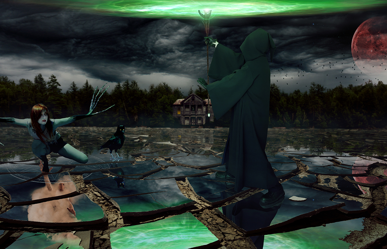
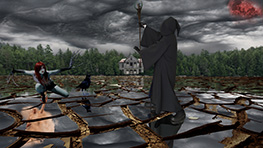
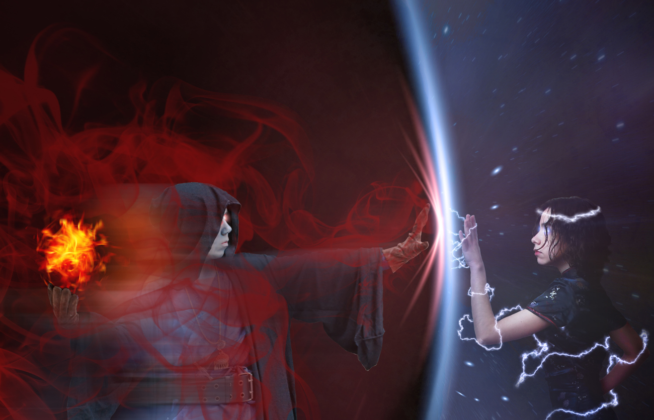
This image tells a story of a witch and warlock. The witch remained in her arcane circle of protection, but when the mirror shattered apart, her wards fell. This allowed the warlock to summon a demon though a portal in the reflection, which comes up to grab the witch. She doesn’t see the demon, but the fight isn’t over for her yet. Meanwhile, her pet cat-bird stands there indifferent to his surroundings, as cats tend to do. That was my idea, anyhow.
I had a vision in my head of how I wanted it to look and I couldn’t be happier with the end result. I wasn’t sure how I was going to implement a lot of the aspects, especially the mirrored effect.
Complex reflections are one of the most difficult things to do in Photoshop because you have to build something that isn’t part of the original photo. Fortunately, I was able to work around parts that would have normally been impossible, while the angle of the shot allowed the background images to be easily flipped with some tweaks and adjustments.
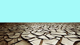
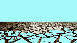
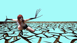
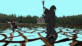
I started with the cracked desert ground. I masked out each rock that I wanted to be part of the broken mirror. It turns out, that would be pretty much all of them. This part took forever! I feel as though I spent more time masking stones than I did on the rest of the design. That’s not true, but the tedium involved with that task sure felt that way!
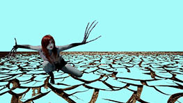
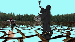
I next added the witch. I first changed the color of her skin that wasn’t painted black. Then I darkened her because the picture was taken in the sun and obviously my image is not a sunny one. I also changed her eye to make her extra-creepy, which I think was quite successful if you zoom in enough to see it. . .
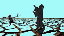
The search for a stock photo of her hooded adversary was fruitless. I just couldn’t find anyone that had their arm out in a position that could hold a staff above their head while at the same time facing the witch. When presented with this type of conundrum, which happens to be in most of my designs, I use myself as a model. This image is no exception. I look pretty awesome, too, if I do say so myself.
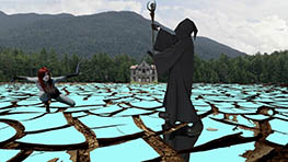
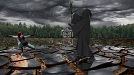
After that, I added the background and sky. The demon was the next tricky subject. I needed to find a photo where the camera was above the person (this is rare) and they were reaching out almost toward the camera but not directly toward the camera (this is rarer). I was lucky enough to find the man I used here who took a photo from the perfect position. I then took a cracked dirt texture and wrapped it around his arms, hands, each finger, and face. For his face, I removed his nose and mouth, because I decided sand demons don’t need to eat or speak.
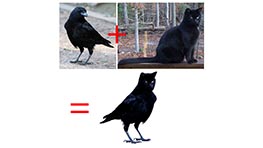
I then created cat-bird. His name is Rufus. It’s such a simple thing, but I was so happy with him. I only put a cat’s head on a bird’s body, blended it, and adjusted the colors to match. I also turned the cat’s eyes a bright yellow to add to the dark ambiance of the image. His reflection was the most difficult part. I think I had to create 4 or 5 layers for the reflection to match. Either way, I think Rufus is awesome!
From there, it was a matter of making sure everything blended together seamlessly and looked appropriate in the image. The moon was a pain in the butt for some reason. From the start, I wanted a red blood moon in my picture, but I didn’t like the way everything looked with just a starry sky and no clouds. And the clouds I decided to use are quite thick, so inserting an oversized moon into the mix just looked ridiculous. I finally masked just the right portions of the clouds that I think it works well in both the sky and the reflection. I fragmented the moon’s reflection because each mirrored rock is facing a slightly different direction.
I then added a bunch of lighting and layer effects to create the darker feel with a green glow on the foreground subjects. I put in fog and a murder of crows flying in the background, and an awesome looking arcane circle around the witch. It’s from a brush, but I broke it apart and made it look like it was etched into the mirror before it shattered apart.
So that’s about it. I normally don’t write this much by way of my process, but I’m writing this the day I finished so it’s all still fresh in my mind. This is also the first time I have ever saved screenshots of my work as I went. Usually, I remove layers to show you how I put it together, but now you can actually see how it came together in chronological order. Yay!
This is also why I have more behind the scenes images than normal. I had all these screenshots and I couldn’t decide which ones to get rid of, so I kept them all.
Anyway, I’m really happy with this design and I hope you like it too. I’m sorry about the creepy aspects. It was originally going to be WAY darker (not gory, just a lot creepier), but I wanted to feel comfortable sharing it without people getting creeped out.
Thanks for checking it out. Let me know what you think below!

