GODDESS OF TIME
PROJECT DETAILS
TITLE: GODDESS OF TIME
DATE: 31 AUGUST, 2017
CATEGORY: DIGITAL ART
ONLINE: ANOVIUS.DEVIANTART.COM
CREDITS:
FOREGROUND
Goddess:
Iardacil-stock: Wandering 6
Tiara:
Imaginationstock: Tiara
Hourglass:
DoidaPorTi-Stock: 302
Pedestal:
mjranum-stock: Pedestals
Sundial:
fuguestock: Sundial
Water on ground:
venomxbaby: Carribean Beach Stock 2
Granite ground:
WebTreatsETC: Stone Pavement Marble Textures
Frame posts:
WebTreatsETC: Stone Pavement Marble Textures
LEFT FRAME
Frame:
Melyssah6-Stock: Mirror Frame Stock IX
Parthenon:
evlampios: Parthenon
CENTER FRAME
Frame:
PhoeebStock: Frame
Ocean:
Queen-Sheba: Ocean
Ship:
Wess4u: Boat 1
Dinghy/row boat:
ItsAllStock: Row Boat
Waterfall:
Enchantedgal-Stock: Waterfall n Mossy Rocks Stock
Splash:
Raeyenirael-Stock: Waves Rock Stock 4
Hanging person:
Me!
RIGHT FRAME
Frame:
tmm-textures: Frame
Future city:
DarkCrea: Orange City Sunset
BACKGROUND
Cosmic sky:
ineedfire: Nebula Effects Fractal Stock
Clouds:
Skybase: Stock: Clouds from Above
Mountain peak:
Burtn: Mountain Trail
Green mountain top:
Grinmir-stock: Mountains X – In the clouds
PROJECT DESCRIPTION
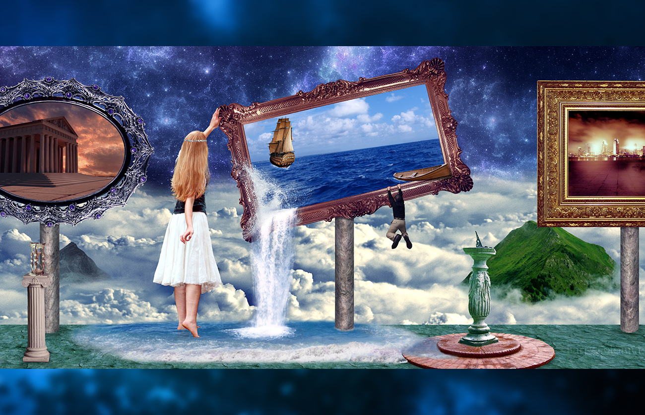
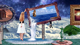
Has it really been 10 months since my last digital art design? Time certainly does fly, as the Goddess of Time above is all too aware of. Nice segue into the image, Barry! *gives self pat on back*
I have been busy as of late and haven’t had any inspiring ideas in quite some time. The idea of a frame opening as a window to another world has been done many times in art, but I’d like to think I made a unique and creative version.
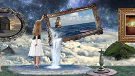
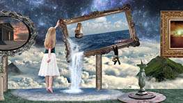
In this design, we have the Goddess of Time in her world beyond worlds. Each frame is a window into a different time period (ancient Greece on the left, the not-so-distant past in the middle, and the future on the right). The one in the center got knocked over and opened the world into her realm. The ocean begins to spill out and a man rowing a small boat inexplicably strikes something solid and gets thrown out. He is now hanging onto the frame for dear life as the goddess is quickly attempting to fix the frame before disrupting the past any further.
That was my idea, anyhow! I hate to admit it, but my original plan was to create a panoramic design that I could split into squares so it could be viewed in its entirety on Instagram by swiping. I just thought it would look cool to be able to do that seamlessly. That was my first thought; the idea for the Goddess of Time came later, but I really couldn’t be happier with how it turned out.
I had planned on making it the length of three squares, but it ended up being too wide and short, and I didn’t like how it appeared. The final project ended up being twice as wide as it was tall, which was perfect.
This was the first time that I used an abundance of color adjustment layers and made use of dodging and burning. I have used them before, but never to this extent. There are over 70 color adjustment layers in this image alone, in addition to a lot of lighting and shadowing effects. Surreal images generally have bright, almost unrealistic colors, which I took full advantage of here. I really wanted all of the colors to pop. I was especially happy with the frame posts, which were originally flat textures. Just a little warping, lighting, and shadows gave it the 3-D effect you see here.
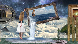
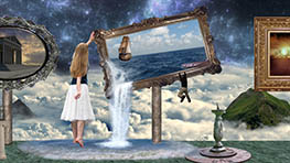
Interestingly, before I added all of the adjustments (you can compare it below; you’ll know it when you see the change), I was quite happy with my progress and the colors involved. Then I changed the colors and…WOW! I felt like the movie Limitless, where everything looks fine until he takes the drug that opens his mind. Then the colors change and it’s so much more bright and vibrant. The old version suddenly appears incredibly dull.
I believe I’ve discussed the colors long enough. I included a cool sundial (I want that in my backyard when I own a house) and an hourglass (I want one of those in my house, too) to go along with the theme. I wanted to add an animal, but none looked right. I entertained the idea of a cat, bird, or snake/serpent, but they made it a little cheesy, so I decided to forego any animals.
As is the case in many of my designs, I felt the need to add myself into it. My reasons are twofold:
- I find it hilarious;
- It allows me to take a photo in the exact position I need, which can oftentimes be difficult to find in stock photos.
I’m the person hanging from the frame, in case you were wondering. The clothes aren’t period appropriate, but they were the best I had. We’re not exactly going for 100% realism here. Speaking of my image, I ended up taking an inordinate number of photos of myself hanging from a pullup bar in order to get the right angle and position. My hands were sore, but I also put myself in odd/painful/dangerous positions, which hurt my shoulders and back more often than not. Fortunately, the picture I chose ended up blending well into the image. I was dreading another hanging photoshoot!
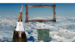
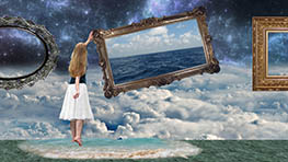
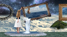
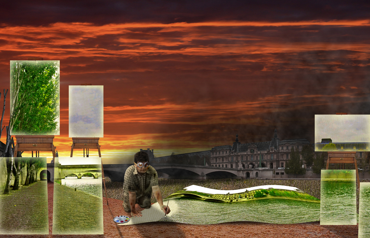
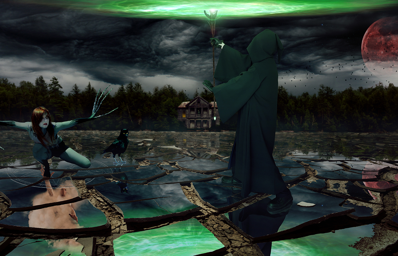
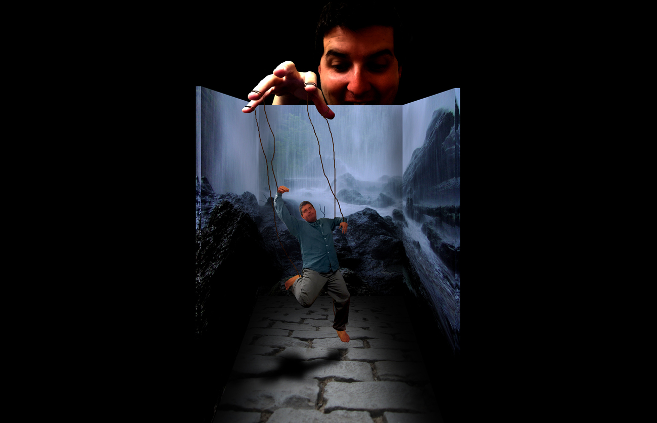
I hope you like the design! I’m really happy with this one. I included some making-of photos below, if you’re so inclined to check them out. Let me know what you think in the comments or on Instagram/Twitter. Thanks for stopping by; hopefully it will be less than a year before I create something new.

