CHANGE OF THE SEASONS
PROJECT DETAILS
TITLE: CHANGE OF THE SEASONS
DATE: 21 JANUARY, 2015
CATEGORY: DIGITAL ART
ONLINE: ANOVIUS.DEVIANTART.COM
CREDITS:
Grass Texture
Goodtextures: Grass Texture 01
Snow Texture
EveLivesey: Snow Texture
Sign:
Wu-Stock: Church Sign
Blue Sky:
Ekoh-Stock: Sky Stock
Dead Tree:
DoloresMinette: Bare Tree
Green Tree:
Moonglowlilly: PNG Tree
Daisies:
Eirian-stock: Daisies
Christmas Lights:
Obsidian Dawn: Christmas Lights PNG
Grass Brushes:
Spiritcoda: Grass Brushes
Falling Snow:
Frostbo: Snow
Grey Sky:
cjohnson7: Storm Clouds cc-by-2.0
Based on tutorial:
psd-dude: Winter Photoshop Manipulation
PROJECT DESCRIPTION
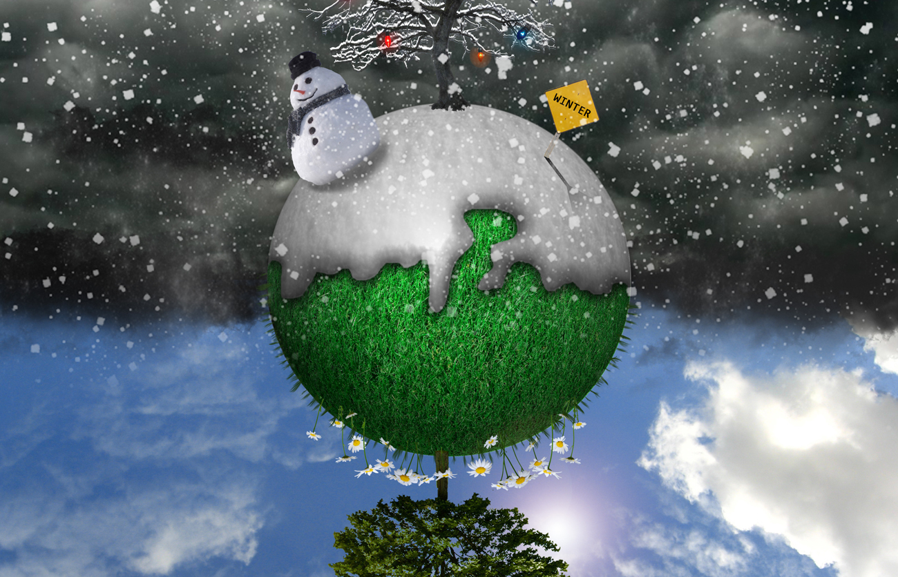
It was a warm, balmy winter's day (bleh) and I decided to make a winter/holiday design to boost my spirits. The moment I saw the tutorial for this gem, I knew I had to make it.
The original tutorial utilized drawings for all of the images, which I am not generally a fan of using in my artwork. I don't mean that it doesn't often look absolutely fantastic in other people's, I just prefer to use actual photos in my designs because I try to make things photorealistic (WHAT DO YOU MEAN THE WORLD DOESN'T LOOK LIKE THAT???). I found some stock photos of exactly what I needed (some drawings, but mostly photos) from the wonderful people on the left.
I created my own spin on the tutorial (Get it? Because the world spins! I'll show myself out.), and I'm really happy with how it turned out. Being as new as I was to Photoshop, I decided to complicate it immensely by using the grass brush to create one blade of grass on each layer so that I could position them around the outside of the globe. I ended up with 60 layers just for the blades of grass. SIXTY. So that was ridiculous.
Also, the trees don't have shadows because reasons. BECAUSE REASONS. If this is earth and each item on it represents a location rather than a gigantic smiling snowman that is bringing about the apocalypse, then they would all have different shadows. Maybe it's nighttime on the north pole. Or maybe it's all an abstract thought or an allegory for life. Either way, I decided not to shadow the trees for reasons I can't recall and I'm still supporting that decision.
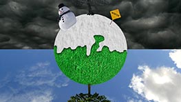
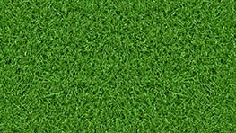
Anyway, I hope you like the summer/winter seasons design. Below are a couple behind the scenes photos to see a little bit of the process. The snow and grass textures both lost some depth when I wrapped them around the globe, but that's to be expected.

